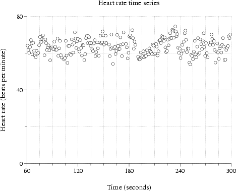
In the figures above, the data are plotted by connecting the points with straight line segments. This is plt's default plot style, and for many plots, it is adequate. For heartrate.dat, however, a scatter plot may be a more appropriate format. The next version of our plot adds the option ``-p 0,1Scircle'' to the plt command in order to create a scatter plot, as shown in figure 2.6:
plt heartrate.data -t "Heart rate time series" \
  -x "Time (seconds)" -y "Heart rate (beats per minute)" \
  -xa 60 300 15 - 4 0 -ya 0 80 20 -g grid,sub \
  -p 0,1Scircle
The use of the -p option to specify a plot style is described in chapter 6; plt offers a wide range of styles. The argument ``0,1Scircle'' specifies that columns 0 and 1 of the data are to be used to make a plot in style S (a scatter plot) using an open circle to mark each data point.